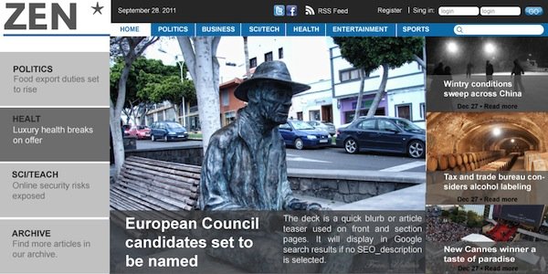
Theme contest prize scooped by Bogotá designer.

William Hernán Gómez González of Columbia has won the 2011 Newscoop Theme Contest with his design Alegría. Despite tough competition from around the globe William's entry came out on top. The jury were looking for designs that explored the potentials of headlines, pictures, videos, audio, widgets, banners, reader interaction and more - all within the context of a modern news site.
The design took into account Newscoop's underlying news structure. The jury received many designs that, although aesthetically beautiful, too often returned to a blog format as the standard navigation. William's site really builds upon the news structure built into Newscoop - publications, issues, sections, articles - to provide a site that would really maximise the information produced in a large newsroom. It was this underlying understanding of structure and journalistic workflow that shone through in the entry and scooped William the prize.
William's design is dominated by bold headlines and photography, showcasing the latest content of the site whilst always prioritising clear navigation bars and submenus. Colourful hierarchies of information guide the eye towards the most important part of the design, whilst allowing secondary information to be read at a glance and clicked through to get the story.
The jury noted in particular William's approach to integrating maps into the design, specifically on the article page. 3D Google Earth views also allow navigation to semantically linked locations. articles in the design accommodate video and images as standard into large central columns that allow an unimpeded longform reading experience that would adapt to either laptops or mobile devices.
William's section pages also stood out for the jury. Rather than resorting to simple lists of articles, a gallery of topically linked articles is presented to the reader allowing easy browsing and overview of recent stories. This makes the most of Newscoop's publication structure and allows for good scalability should his publication start to expand and diversify its range of content.
William made the most of Newscoop's template structure $gimme by allowing each page to pull in varying amounts of dynamic information from the article - authors, date of publication, section and so on. Redesign at a later date would be easy, as would specific redevelopments for future platforms.
Check out the photogallery of William's winning design!
