Google changed the rules, but Newscoop has you covered

These days, most companies are on a seemingly unending quest to get a better rating in Google search results. Don’t make it harder on yourself then you need to! In addition to a variety of factors that affect the rating, Google has officially announced that from the 21st of April, mobile-friendliness will become an important factor for search result ranking.
According to Google, “This change will affect mobile searches in all languages worldwide and will have a significant impact in our search results.” In addition to this, websites will now be labeled as mobile-friendly in search results.
Mobile friendly website example in Google search results
This means that starting April 21st, if your website isn’t recognised by Google as mobile friendly, it will become harder to find in the search results and will occupy a lower position with a lower rating.
Thus far, changes in Google search algorithms have had a big impact on website rankings as well as on the rate of business for some companies, especially those that are primarily web oriented.
With over 114 billion searches per month, Google has been one of the most important internet services and the starting point for 67.53% user searches in 2014. The importance of Google search becomes obvious when you take a look at mobile search statistics - Google’s market share is 91.45% with its closest competitor, Yahoo, at 5.48%.
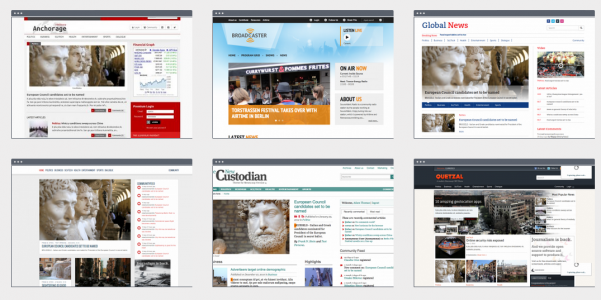
If you are looking to build a news website, take a look at our free themes, all of which are optimised for Google mobile results. Our themes are made for Newscoop, a CMS for news professionals.
Here are a few important tips for optimisation:
1. Follow the natural behaviour and flow of HTML elements in the design
In deciding what content to use, be aware of what is most important to display on the page. Elements of the desktop and mobile versions should be the same and should have a natural flow, but repeating the same element twice is not desirable.
2. Set viewport
Viewport tells the browser that the page needs to be scaled to fit the screen. If you want your website to work on mobile properly, you need to be sure to set viewport.
It should be placed in the HTML head and set to: <meta name="viewport" content="width=device-width, initial-scale=1">
3. Add breakpoints
During testing, when you notice that some element does not behave well, you can use breakpoints. They will help to change the behavior or appearance of the element only for certain screen sizes.
@media (max-width: 480px) {.container {width: 100%;}}
4. Element and font sizes
Using max-width and percentages for element sizes can help give you more fluid behaviour. Be sure to pay attention to readability by adjusting the font size to the screen.
Contact us for more information
For any questions you may have, feel free to send us an email!
If you are new to Newscoop, take a look at our getting started manual and FAQ’s for more information.
For all additional questions about Newscoop, visit our help center, manuals or our forums for more information.
